About the project
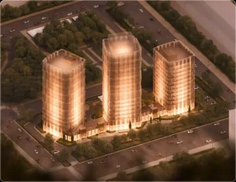
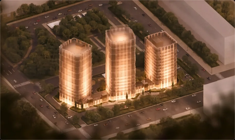
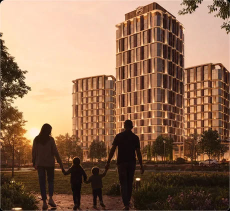
Our task was to create an identity that doesn't stand apart from the project but continues its character. The visual system is built on the silhouette of the three towers, the vertical rhythm of the façades and the architecture of the complex.
Metaphor
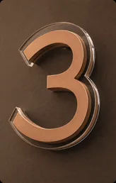
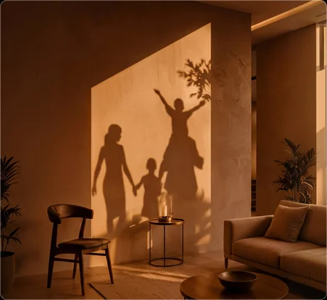
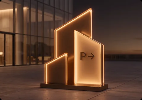
Three towers. One brand. Architecture became the foundation of the visual language — from the mark to communication, sales, wayfinding and environment.
Logo
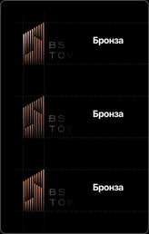
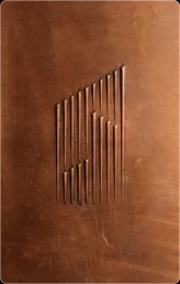
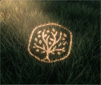
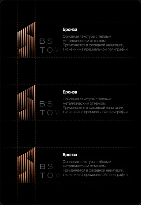
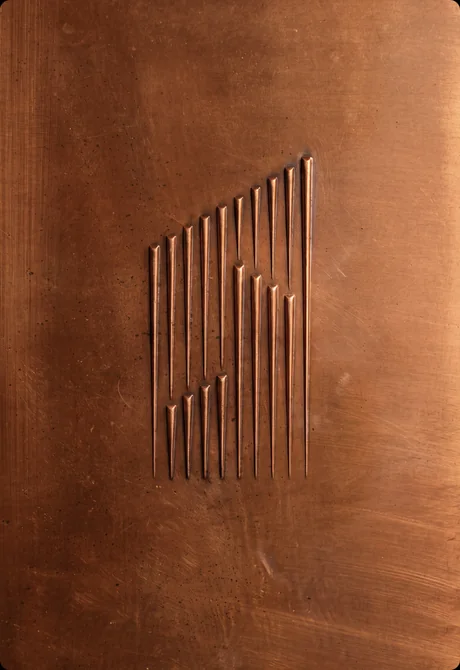
The logo is built on the three BS Towers and the vertical rhythm of their façades. The architecture of the complex directly shapes the brand mark.
Typography
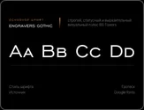
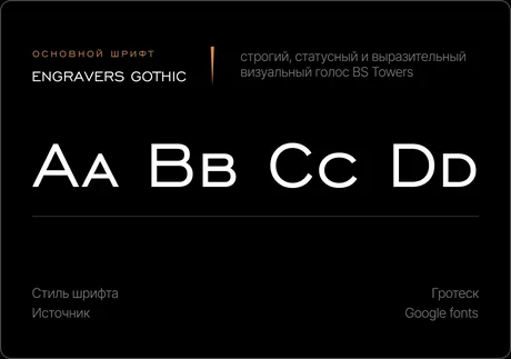
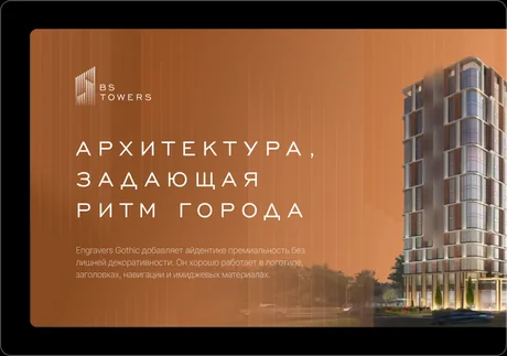
A strict typographic system supports the brand's architectural character and creates a clear hierarchy across every communication format.
Colour
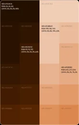
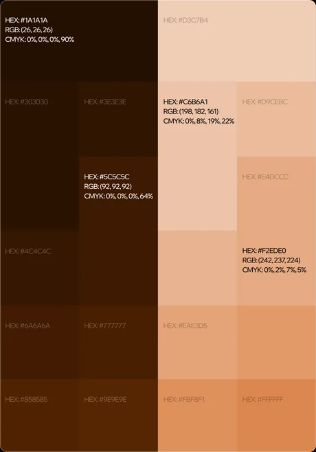
A restrained palette of graphite and warm light tones continues the character of the architecture and forms a calm, premium visual language.
Applications
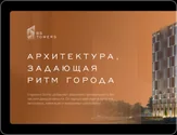
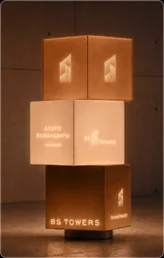
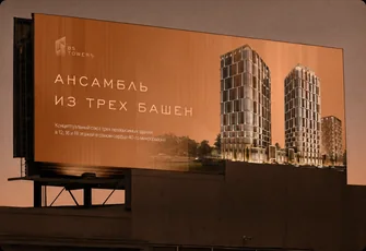
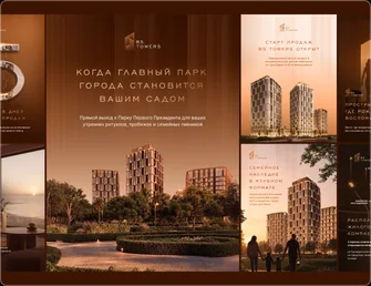
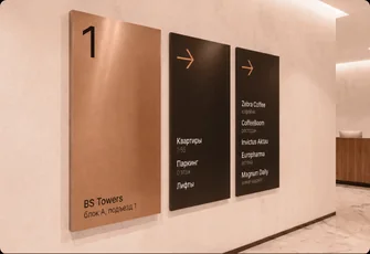
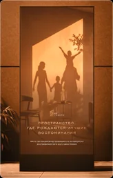
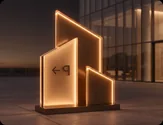
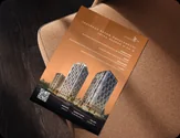
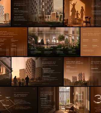
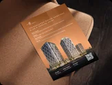
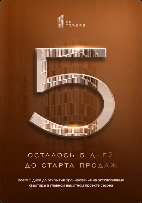
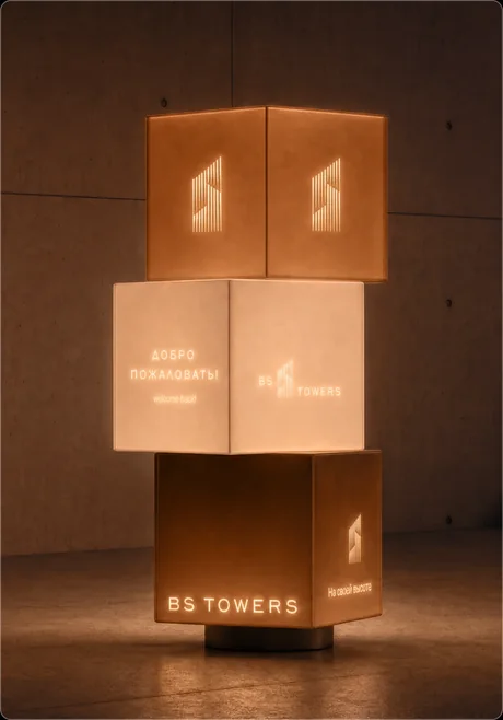
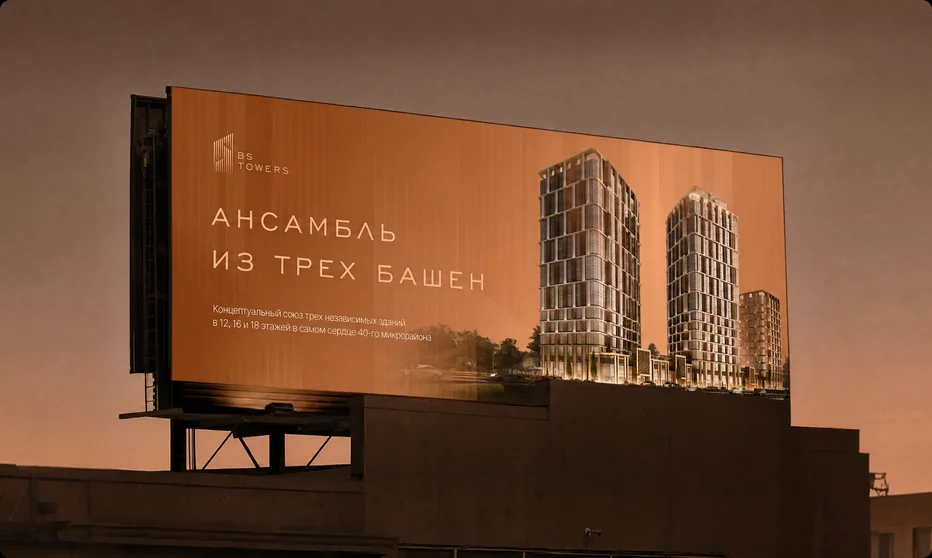
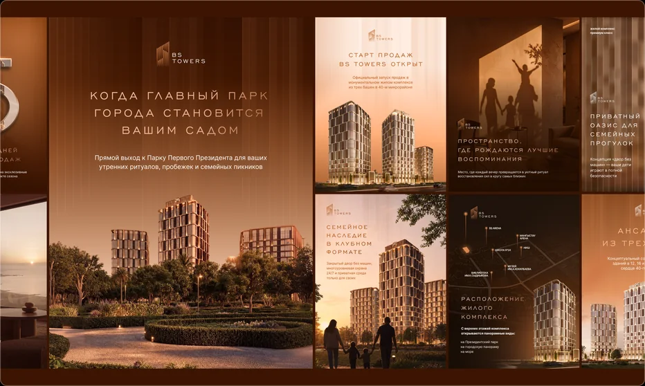
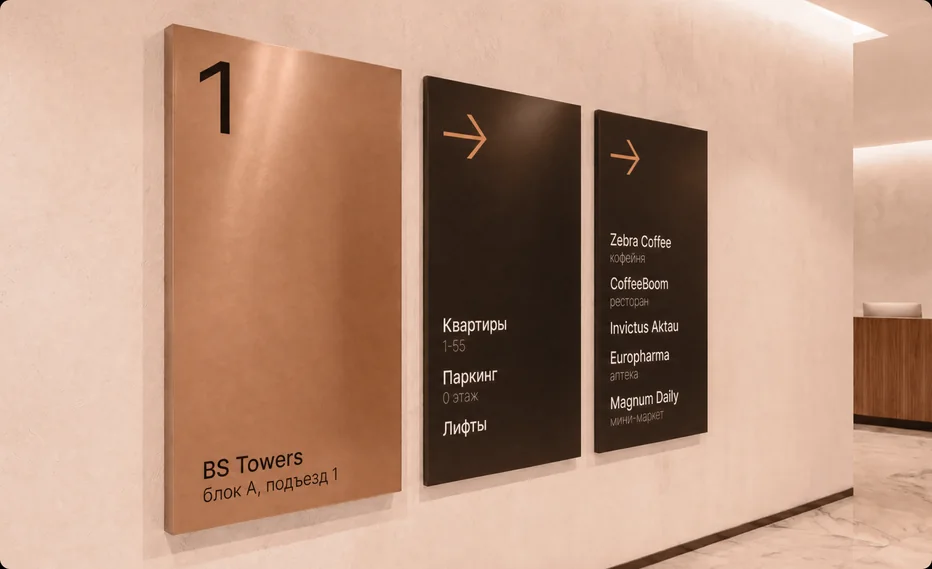
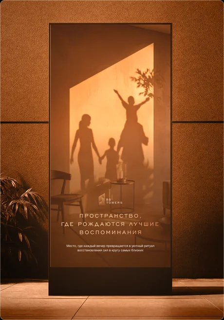
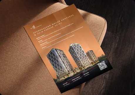
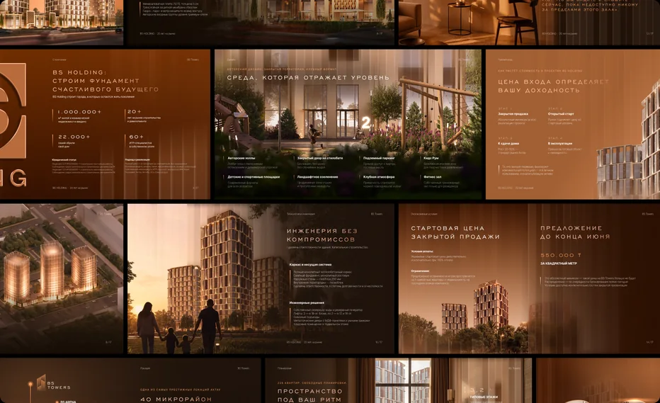
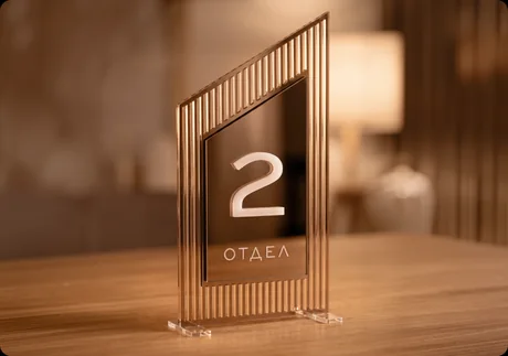
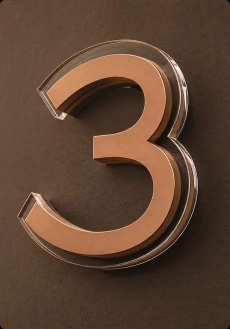
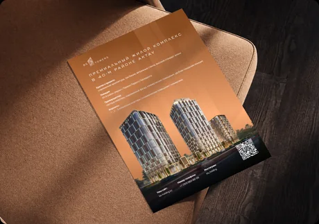
The identity works consistently across every touchpoint: digital, sales materials, wayfinding and interior environment.
MŪRA
Next case
 View