About the project
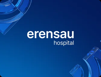
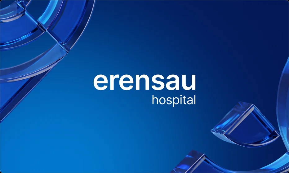
Erensau Hospital is a private multidisciplinary clinic in Almaty. We refreshed the brand's visual system and carried it into digital communication, the website and other patient touchpoints.
Visual idea
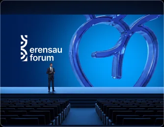
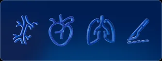
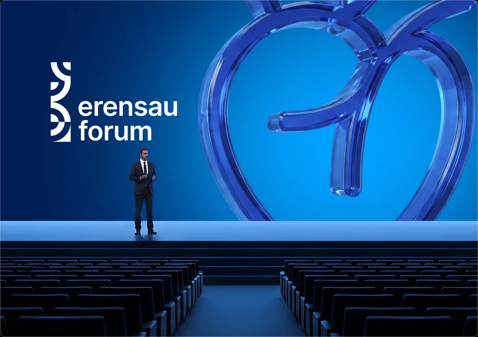
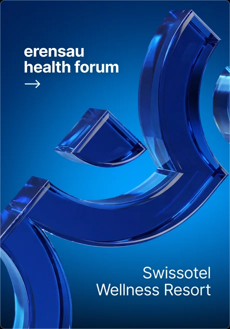
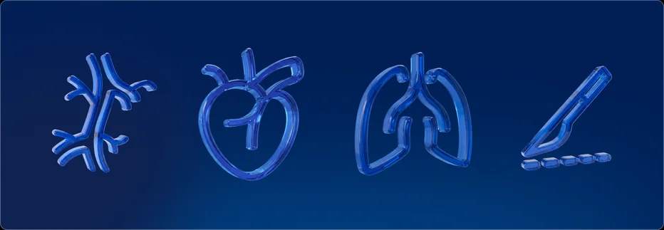
The system is built on the idea of a precise solution. Concentric graphics draw attention to a single point and form a recognisable visual principle for brand communication.


Logo
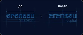
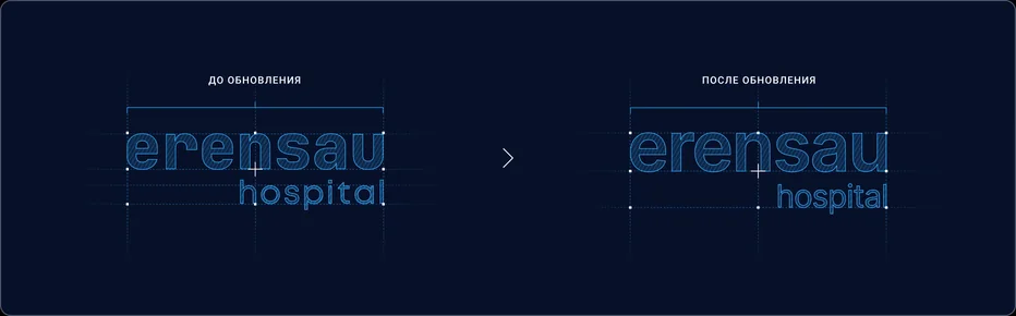
We updated the Erensau logo, keeping the brand recognisable while making the mark tighter, more contemporary and better suited to digital.
Typography
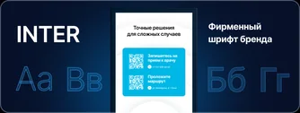
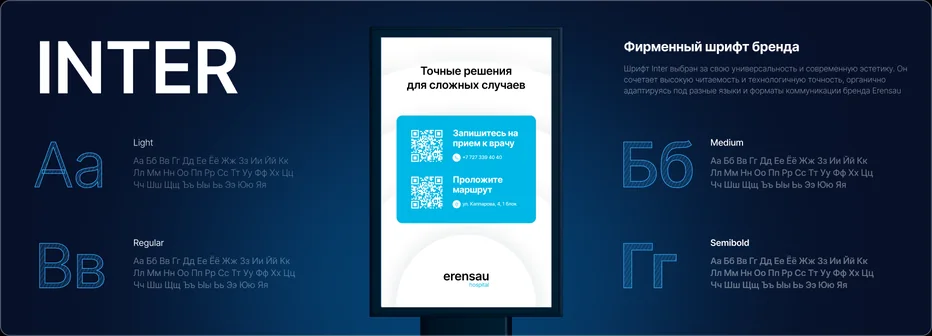
The typographic system is built on Inter — a neutral, highly legible grotesque that works equally well in medical communication, wayfinding and digital interfaces.
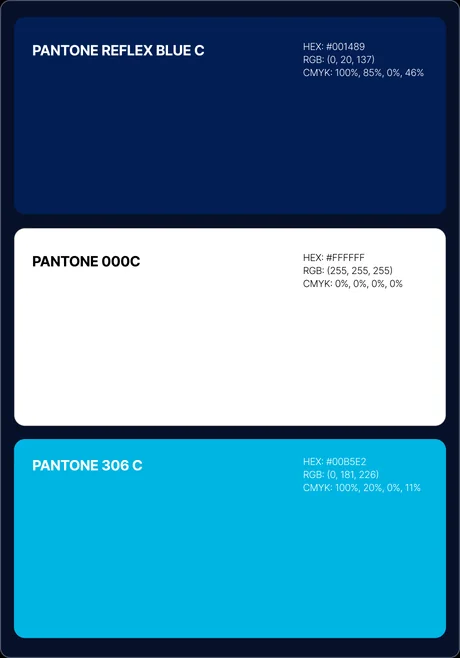
Colour
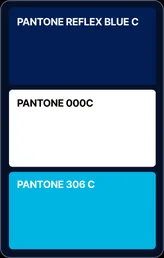
Deep blue conveys professionalism and trust, while light blue adds a sense of technology and visual clarity.
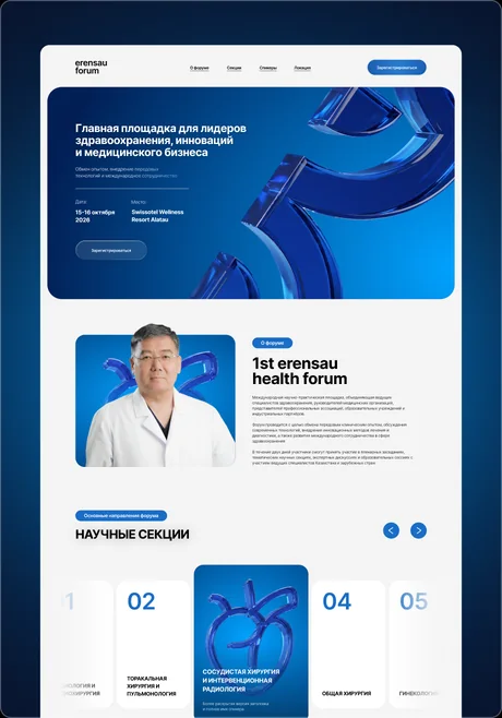
Applications
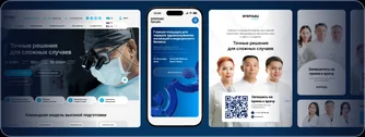
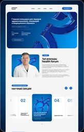
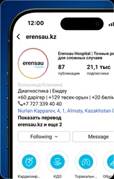
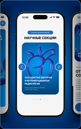
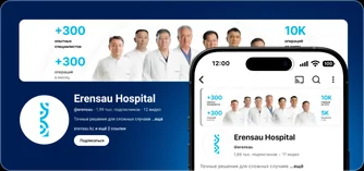
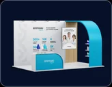
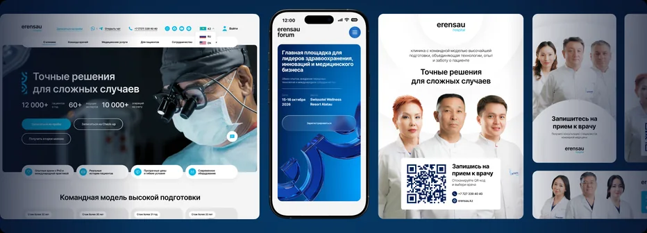
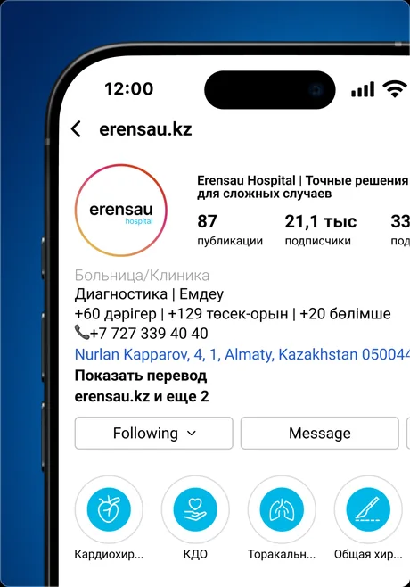
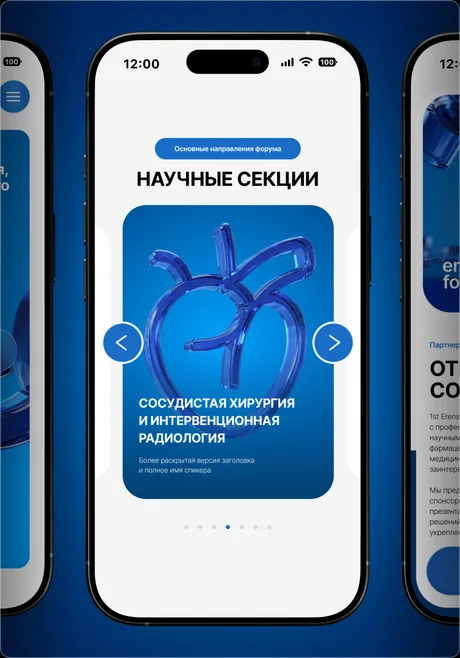
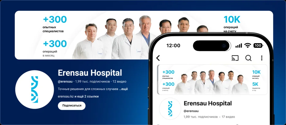
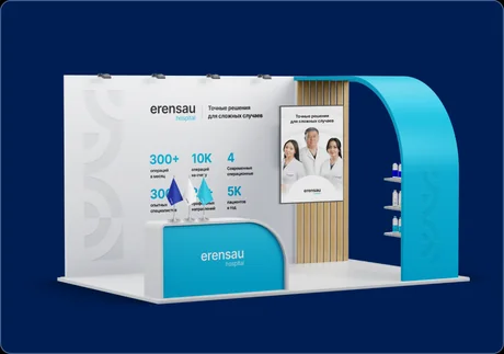
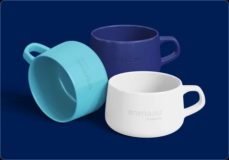
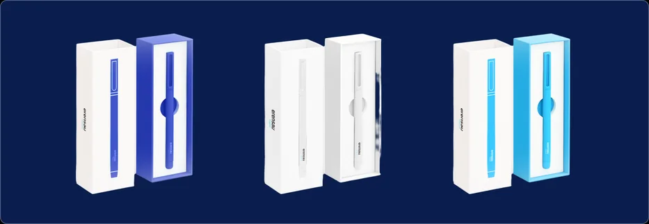
The identity extends to digital, SMM, interfaces and the clinic's communication materials. One visual language holds across every format — from booking an appointment to Erensau's own projects.


Pai Pie
Next case
 View