About the project
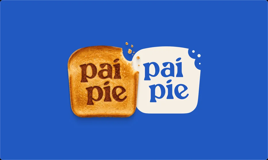
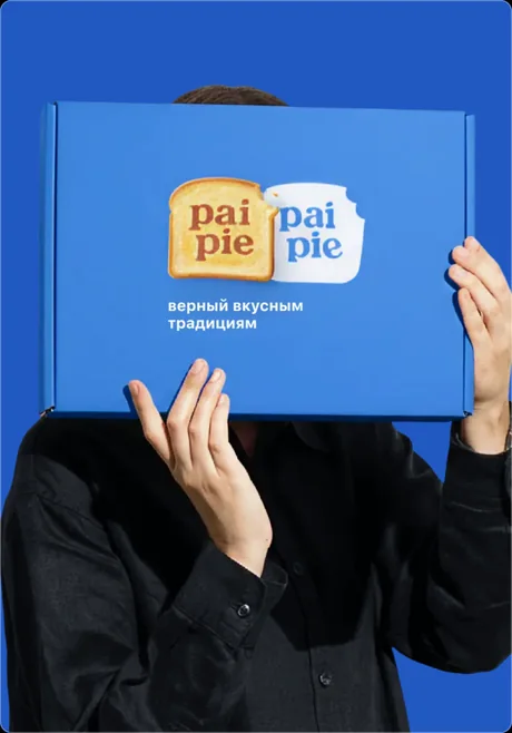
We rebranded Nuroma as Pai Pie — a contemporary confectionery brand inspired by Kazakhstan's traditions. The new identity pairs the warmth of familiar flavours with a modern visual aesthetic.
Metaphor
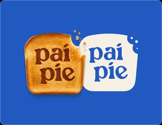
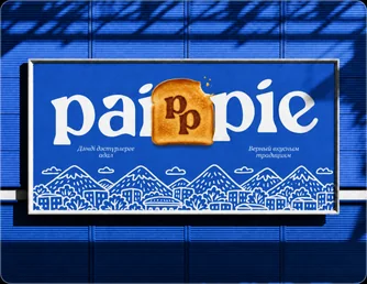
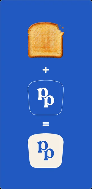
The identity grows from a familiar image of baking, turned into a recognisable brand mark. A simple form became the basis of a flexible system that adapts easily to any medium.
Logo
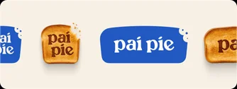
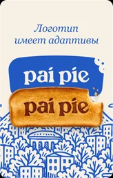
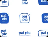
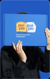
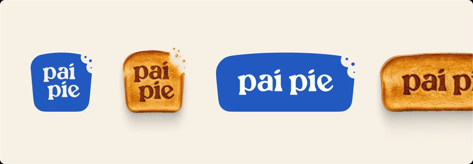
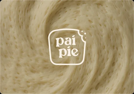
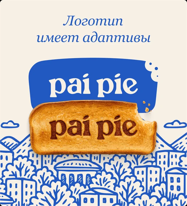
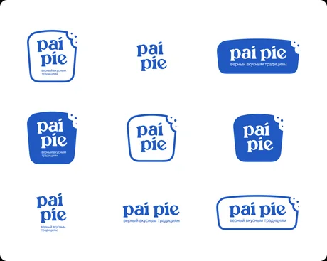
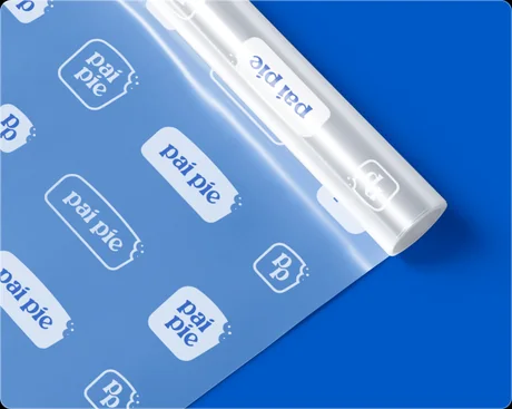
The Pai Pie logo comes in several adaptations and stays recognisable on packaging, in communication and in digital.
Typography
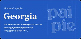
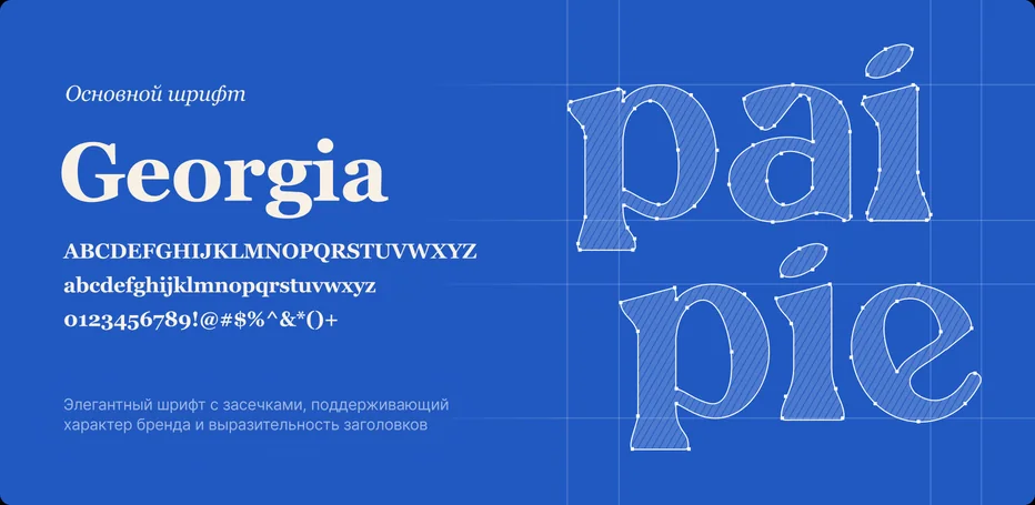
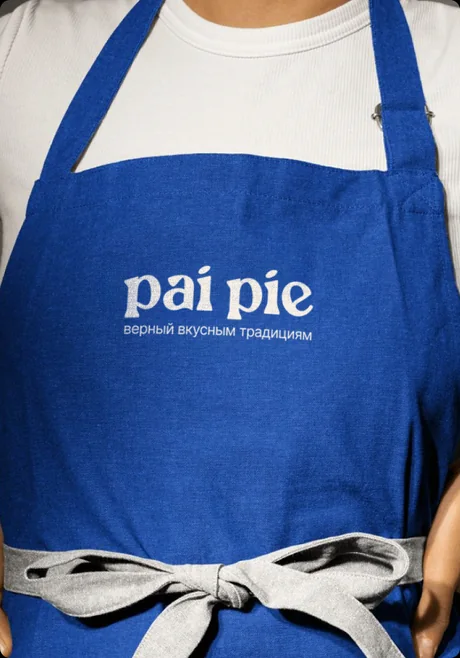
Expressive typography shapes the brand's character, balancing contemporary design with the warmth of tradition.
Colour
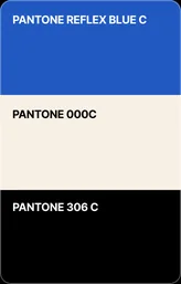
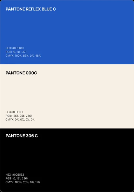
Rich blue, soft cream and contrasting accents create a bright, recognisable visual language.
Applications
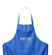
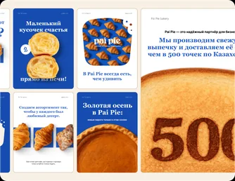
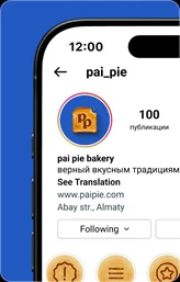
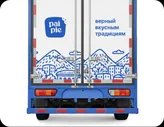
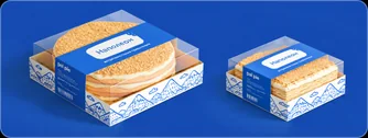
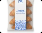
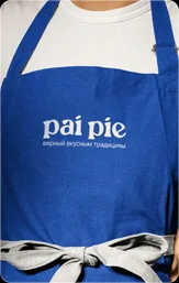
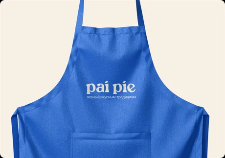
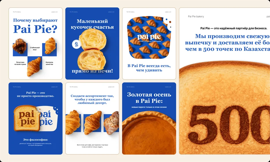
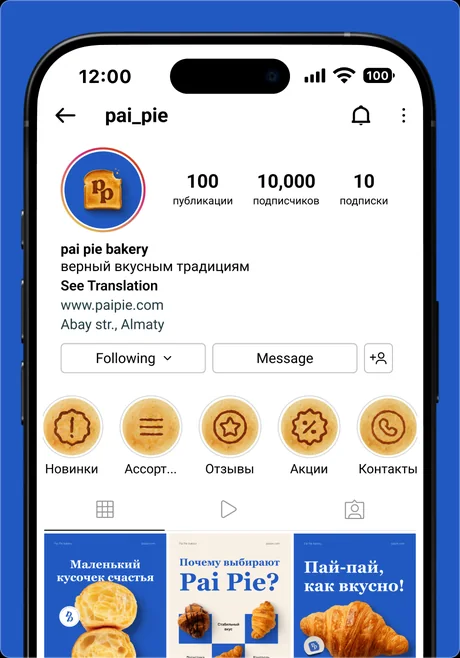
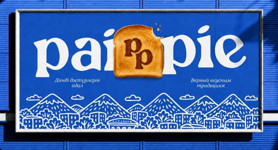
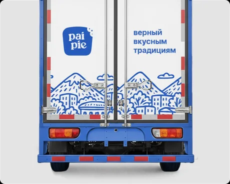
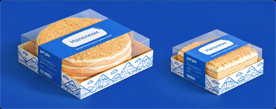
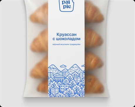
The brand system works across packaging, social media, outdoor advertising and branded materials.
Standard Air
Next case
 View