About the project
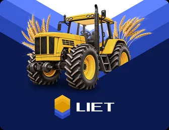
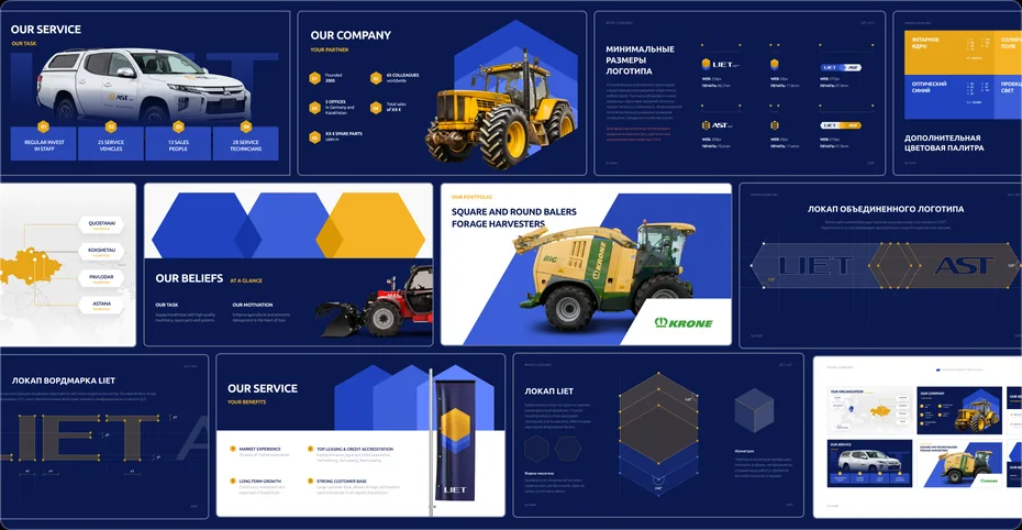
We refreshed the identity of LIET, an agricultural machinery brand with more than 20 years of experience. The brand stays recognisable, now within a contemporary visual system that reflects the company's precision, technology and character.
Metaphor
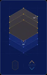
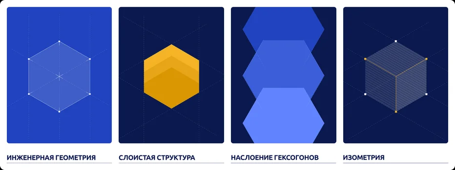
The system is built on engineering geometry. Clean forms, measured proportions and a layered structure convey the brand's technical character.


Logo
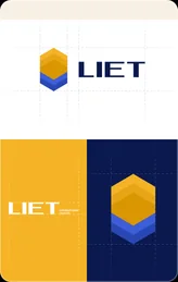
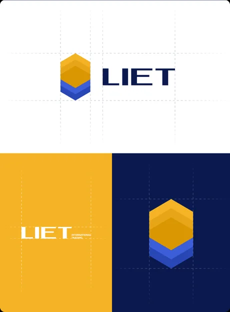
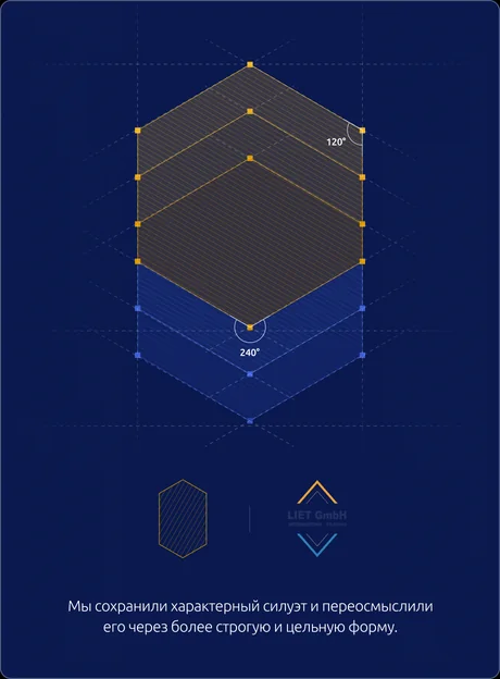
We reworked the LIET mark as a layered geometric form — keeping it recognisable while strengthening its construction and visual integrity.
Typography
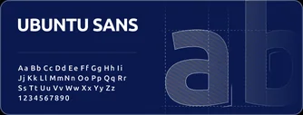
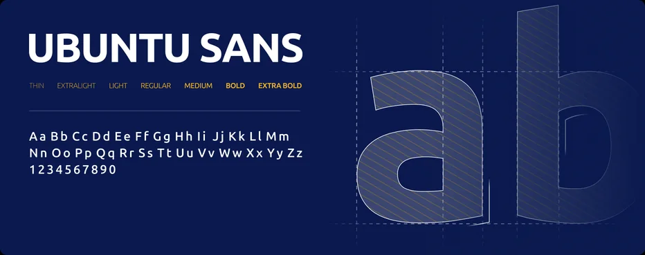
Ubuntu Sans supports the precise, functional character of the identity and works with equal confidence in technical materials, advertising and digital.
Colour
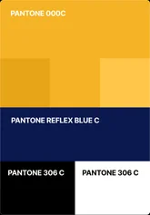
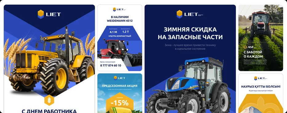
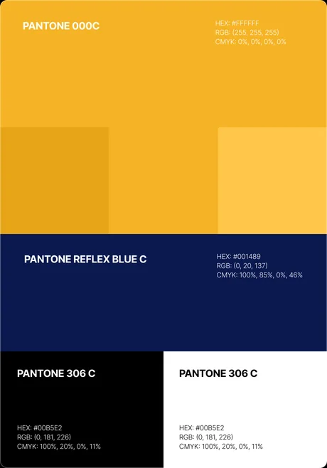
Deep blue, bright yellow and white form a high-contrast system built for strong recognition across every format.
Applications
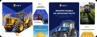
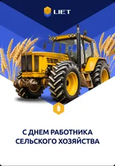
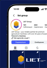
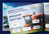
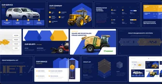
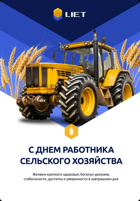
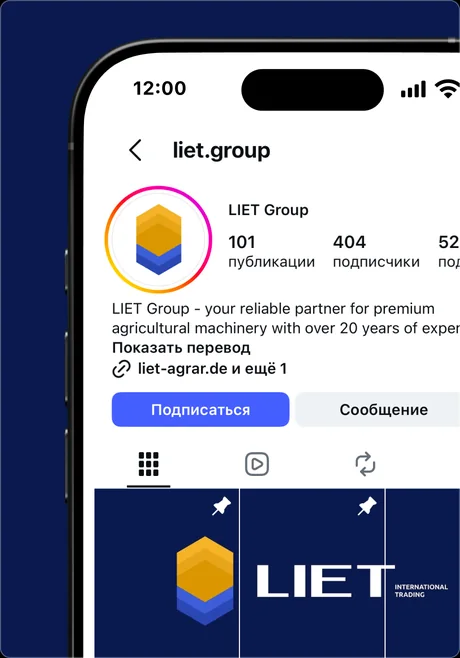
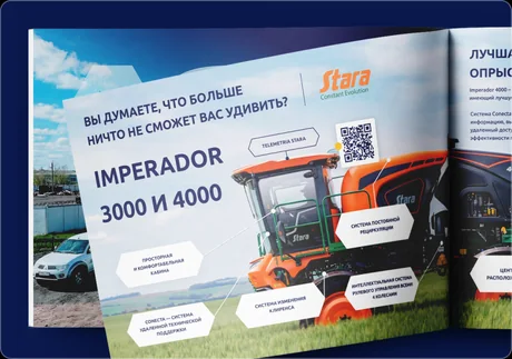
The system scales to social media, presentations, digital materials and branded communication.


BS Towers
Next case
 View